
Comsys Web design offers unsurpassed quality websites in any niche.
Are you about to embark on a new web design project for your business? Want to ensure your design isn’t filled with mistakes that could hold your website back?
Forth & Create share their website typography sins to avoid in this infographic.
Here’s a quick summary of what they cover:
- Too close
- Too stretched
- Too many fonts
- No contrast
- Orphan
- Hierarchy
- Legibility
- Bad kerning
- Wrong font choice
- Uppercase
Check out the infographic for more detail.
![10 Web Design Sins That Will Kill Your Chances of Online Success [Infographic]](https://red-website-design.co.uk/wp-content/uploads/2019/06/10-Suicidal-Web-Design-Sins-That-Will-Kill-Your-Chances-of-Online-Success.jpg)
Typography is often overlooked in website design, but it plays a crucial role in how users perceive and interact with your site.
Poor typography can make your website difficult to read, navigate, and ultimately drive users away.
In this blog post, we’ll explore 10 typography sins that could be detrimental to your website’s success and offer tips on how to avoid them.
Too Close
One of the most common typography sins is setting your text too close together. This makes it difficult for readers to distinguish between individual letters and words, leading to eye strain and frustration.
- Understanding Line Spacing (Leading): Line spacing, also known as leading, refers to the vertical space between lines of text. When the lines are too close together, it can make the text look cramped and difficult to read. On the other hand, too much space between lines can cause the text to look disjointed. Finding the right balance is key to enhancing readability.
- Optimal Line Spacing for Different Font Sizes: The optimal line spacing can vary depending on the font size and style you’re using. Generally, larger fonts may require more space between lines to maintain readability, while smaller fonts may need less spacing to prevent text from appearing too spread out. Experiment with different line spacing options to find the right balance for your website’s typography.
- Consideration for Different Devices: Keep in mind that line spacing can look different across various devices and screen sizes. What looks perfectly spaced on a desktop monitor may appear too cramped on a mobile device. Be sure to test your website’s typography on different devices to ensure readability across the board.
- Balancing Readability and Design: While it’s essential to prioritize readability, you also want your typography to align with your website’s overall design aesthetic. Striking a balance between readability and design can be achieved by adjusting line spacing in relation to other design elements such as font size, color, and layout.
- Tools for Adjusting Line Spacing: Most website design platforms and text editors offer options to adjust line spacing easily. Whether you’re using a content management system like WordPress or designing custom HTML/CSS, you can typically adjust line spacing settings directly within the editor. Take advantage of these tools to fine-tune your typography for optimal readability.
- Test, Iterate, and Refine: Typography is as much about experimentation as it is about following best practices. Don’t be afraid to test different line spacing options and gather feedback from users to identify what works best for your audience. Use analytics tools to track user engagement and adjust your typography accordingly.
- Accessibility Considerations: In addition to visual aesthetics, it’s crucial to consider accessibility when adjusting line spacing. Some users may have visual impairments that require larger line spacing for improved readability. Make sure your website’s typography meets accessibility standards to ensure inclusivity for all users.
- Seek Professional Guidance if Needed: If you’re unsure about how to optimize your website’s typography, consider consulting with a professional designer or typography expert. They can provide valuable insights and recommendations tailored to your specific business needs and target audience.
Too Stretched
Stretching your text horizontally or vertically distorts the letterforms, making them harder to read. Stick to the original proportions of the font to maintain legibility.
If you need to adjust the width of your text, consider using a different font or adjusting the letter spacing (tracking) instead.
- Maintain Font Proportions: When adjusting the width of text, it’s essential to maintain the original proportions of the font. Stretching text horizontally or vertically can distort the letterforms, making them harder to read and visually unappealing. Instead, opt for fonts that offer different styles or weights to achieve the desired emphasis without compromising legibility.
- Use Font Styles Wisely: Many fonts come with a variety of styles, including regular, bold, italic, and condensed. Instead of stretching the text, consider using different font styles to add emphasis or variation to your typography. For example, if you need to highlight a specific word or phrase, use a bold or italic style instead of stretching the text.
- Adjust Letter Spacing (Tracking): If you find that your text looks too cramped horizontally, consider adjusting the letter spacing, also known as tracking. Increasing the tracking slightly can help improve readability and visual appeal without distorting the letterforms. Most design software and website builders offer options to adjust letter spacing easily.
- Experiment with Font Size and Weight: Instead of stretching text to make it stand out, experiment with different font sizes and weights to create emphasis and hierarchy. Larger font sizes or bold weights can draw attention to important headings or key points without sacrificing readability. Reserve stretching for very minimal adjustments, if necessary.
- Consider Responsive Design: Keep in mind that stretched text may not scale well across different devices and screen sizes. What looks acceptable on a desktop monitor may appear distorted or difficult to read on a mobile device. When designing your website, consider how stretched text will appear on various devices and adjust accordingly for responsive design.
- Avoid Extreme Stretching: While it may be tempting to stretch text to fill space or make it more prominent, avoid extreme stretching at all costs. Extreme stretching not only compromises readability but also detracts from the professionalism and credibility of your website. Aim for subtle adjustments that enhance rather than detract from your typography.
- Test for Legibility: Before finalizing any changes to your typography, be sure to test for legibility across different devices and screen sizes. Ask for feedback from colleagues or friends to ensure that stretched text is still easy to read and visually appealing. Make adjustments as needed to optimize readability and user experience.
- Consult Design Resources: If you’re unsure about how to adjust your typography effectively, consider consulting design resources or seeking advice from professional designers. They can provide valuable insights and recommendations tailored to your specific business needs and target audience.
Too Many Fonts
Using too many different fonts on your website can create visual chaos and distract users from your content. Stick to a maximum of two or three complementary fonts for your headings, subheadings, and body text to maintain consistency and readability.
- Stick to a Maximum of Three Fonts: When it comes to typography on your website, less is often more. Using too many different fonts can create visual clutter and make your site appear unprofessional. Aim to stick to a maximum of three fonts: one for headings, one for subheadings, and one for body text. This will help maintain consistency and cohesion throughout your website.
- Choose Complementary Fonts: When selecting fonts for your website, choose ones that complement each other well. Look for fonts that have similar characteristics or styles to create a cohesive look and feel. For example, pairing a serif font with a sans-serif font can create an interesting contrast without feeling disjointed.
- Establish a Hierarchy: Establishing a clear hierarchy of fonts is essential for guiding users through your content and emphasizing important information. Use different font sizes, weights, and styles to indicate headings, subheadings, and body text. This will help users quickly scan and prioritize information on your website.
- Consider Branding Guidelines: If your small business has established branding guidelines, be sure to follow them when choosing fonts for your website. Using fonts that align with your brand’s identity will help reinforce brand recognition and maintain consistency across all marketing materials.
- Limit Decorative Fonts: While decorative fonts can add personality to your website, they should be used sparingly and only for specific design elements such as logos or banners. Avoid using decorative fonts for body text or headings, as they can be difficult to read and distract from your content.
- Test for Readability: Before finalizing your font choices, be sure to test for readability across different devices and screen sizes. Make sure that your chosen fonts are easy to read and visually appealing on desktops, laptops, tablets, and mobile devices. Ask for feedback from colleagues or friends to ensure that your typography is user-friendly.
- Use Font Variations Instead of New Fonts: Instead of introducing new fonts to add variation to your typography, consider using different variations of the same font family. Many fonts come with a variety of styles, weights, and sizes that can be used to create hierarchy and emphasis without introducing unnecessary complexity.
- Maintain Consistency Across Pages: Consistency is key when it comes to typography on your website. Make sure that your font choices remain consistent across all pages to create a seamless user experience. This includes headings, subheadings, body text, and any other text elements.
- Seek Inspiration from Design Resources: If you’re unsure about which fonts to choose for your website, seek inspiration from design resources such as websites, blogs, or design books. Look for examples of typography that resonate with your brand’s identity and style, and use them as a reference when selecting fonts for your own website.
No Contrast
Lack of contrast between your text and background can make it difficult for users with visual impairments to read your content. Make sure to choose colors with sufficient contrast and avoid placing text over busy or patterned backgrounds.
- Importance of Contrast: Contrast is crucial for ensuring that your text is easily readable against its background. Without sufficient contrast, text can blend into the background or become illegible, resulting in a poor user experience and potentially driving visitors away from your website.
- Contrast Ratio Guidelines: Aim for a minimum contrast ratio of 4.5:1 between your text and its background for standard text, and 3:1 for larger text (such as headings or important information). This ensures that text is accessible to users with visual impairments and meets accessibility standards.
- Test Contrast Ratios: Use online contrast ratio tools or browser extensions to test the contrast ratio of your text against its background. These tools will provide feedback on whether your text meets accessibility guidelines and help you make necessary adjustments to improve readability.
- Choose High-Contrast Colors: When selecting colors for your text and background, opt for high-contrast combinations that make text stand out clearly. For example, black text on a white background or white text on a dark background typically offers strong contrast and is easy to read.
- Consider Accessibility Needs: Keep in mind that users with visual impairments or color blindness may have difficulty reading text with low contrast. Choose colors that provide sufficient contrast even for users with reduced vision, and avoid relying solely on color to convey information.
- Test Across Devices and Environments: Test your website’s contrast across different devices, screen sizes, and lighting conditions to ensure readability in various environments. What looks clear and legible on your computer monitor may appear differently on a mobile device or under different lighting conditions.
- Use Contrast for Emphasis: In addition to enhancing readability, contrast can also be used to draw attention to important elements on your website. Use high-contrast colors for buttons, links, or calls to action to make them stand out and encourage user interaction.
- Avoid Busy Backgrounds: Avoid using busy or visually distracting backgrounds behind your text, as they can reduce contrast and make text harder to read. Opt for clean, simple backgrounds that provide a clear contrast with your text and enhance readability.
- Test with Real Users: Once you’ve implemented contrast adjustments, conduct user testing with individuals who have varying levels of visual acuity to ensure that your text is accessible to all users. Gather feedback on readability and make any necessary refinements based on user input.
- Stay Informed on Accessibility Guidelines: Stay informed on accessibility guidelines and best practices for web typography to ensure that your website meets the needs of all users. Familiarize yourself with standards such as the Web Content Accessibility Guidelines (WCAG) to ensure compliance and inclusivity.
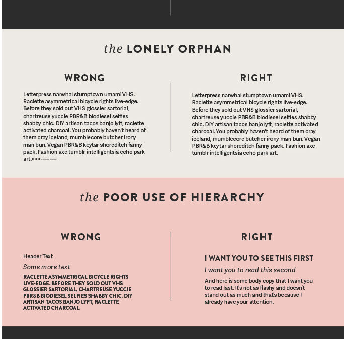
Orphan
An orphan occurs when a single word is left on a line by itself at the end of a paragraph. This disrupts the flow of reading and can be visually unappealing. Adjust your line breaks or hyphenate words if necessary to avoid orphans and keep your paragraphs visually balanced.
- Adjust Line Length: One way to avoid orphans is by adjusting the length of your lines of text. Aim for a comfortable line length that allows for enough words per line to prevent orphans without creating excessively long lines. This may involve adjusting the width of your text containers or adjusting margins.
- Hyphenation: Hyphenation can help prevent orphans by allowing longer words to break across lines more evenly. Most word processing software and website design tools offer automatic hyphenation settings that you can enable to help prevent orphans. However, be mindful of hyphenation settings as excessive hyphenation can also disrupt readability.
- Adjust Paragraph Formatting: Adjusting paragraph formatting can also help prevent orphans. For example, increasing the spacing between lines (leading) can sometimes prevent orphans by allowing more flexibility in line breaks. Additionally, adjusting the spacing between words (justification) can help distribute text more evenly across lines.
- Manual Adjustments: In some cases, manual adjustments may be necessary to prevent orphans. This could involve rewording sentences or adjusting line breaks to ensure that no single word is left on a line by itself. While manual adjustments can be time-consuming, they can help achieve a polished and professional-looking typography.
- Consider Text Alignment: The text alignment you choose can also impact the likelihood of encountering orphans. For example, justified text alignment may increase the risk of orphans compared to left-aligned or ragged-right text. Consider the pros and cons of different text alignments and choose the one that best balances readability and aesthetics for your content.
- Test Across Devices and Screen Sizes: When designing your website, be sure to test your typography across different devices and screen sizes. What looks acceptable on a desktop monitor may result in orphans on smaller screens such as smartphones or tablets. Adjustments may be necessary to ensure a consistent and visually appealing layout across devices.
- Utilize Design Software Features: Take advantage of features offered by design software or website builders to help prevent orphans. For example, some software may offer options for adjusting line spacing, hyphenation settings, or text alignment preferences. Explore these features to optimize your typography and reduce the risk of encountering orphans.
- Consider Responsive Design: Responsive design principles can also help mitigate the risk of encountering orphans on different devices. By designing with flexibility in mind, you can ensure that your typography adapts gracefully to various screen sizes and orientations, minimizing the likelihood of orphans.
Hierarchy
Proper hierarchy is essential for guiding users through your content and highlighting important information. Use different font sizes, weights, and styles to create visual hierarchy and make it easy for users to scan and prioritize information on your website.
- Understanding Typography Hierarchy: Typography hierarchy refers to the organization and prioritization of text elements on a page based on their importance. By establishing a clear hierarchy, you guide users through your content, helping them understand the relationship between different pieces of information and navigate your website more effectively.
- Use Font Size to Establish Hierarchy: One of the most common ways to establish hierarchy is by using font size. Larger font sizes naturally draw more attention and can be used for headings, subheadings, and other important text elements. Reserve smaller font sizes for less important text or body content.
- Experiment with Font Weight and Style: Font weight and style also play a significant role in establishing hierarchy. Bold or italic text can be used to add emphasis to specific words or phrases within a paragraph, while regular weight is typically used for standard body text. Experiment with different font styles to create contrast and hierarchy within your typography.
- Differentiate Headings and Subheadings: Headings and subheadings should be visually distinct from body text to clearly indicate their hierarchical relationship. Consider using different font sizes, weights, or styles for headings and subheadings to make them stand out and guide users through your content.
- Consistency is Key: Consistency is crucial for establishing a clear hierarchy throughout your website. Use the same font styles, sizes, and weights consistently across all pages to maintain a cohesive look and feel. Consistent typography helps users understand your website’s structure and navigate content more easily.
- Consider Visual Hierarchy: Visual hierarchy goes beyond font size and style and encompasses factors such as color, spacing, and layout. Use these elements strategically to further reinforce the hierarchy of your typography. For example, use color to differentiate headings from body text or add visual cues such as bullet points or icons to highlight key information.
- Prioritize Important Information: Identify the most important pieces of information on your website and prioritize them in your typography hierarchy. Make sure that essential information such as product names, prices, or calls to action are prominently featured and easy to find within your typography.
- Test for Readability and Clarity: Before finalizing your typography hierarchy, test it for readability and clarity. Ask for feedback from colleagues or friends to ensure that the hierarchy is clear and intuitive for users. Make adjustments as needed to improve readability and usability.
- Consider Branding and Design Guidelines: When establishing typography hierarchy, consider your brand’s identity and design guidelines. Choose fonts and styles that align with your brand’s personality and values, and ensure that your typography hierarchy reflects the overall aesthetic of your brand.
- Embrace Responsive Design: Responsive design principles are essential for ensuring that your typography hierarchy remains effective across different devices and screen sizes. Test your typography hierarchy on various devices to ensure that it adapts gracefully and maintains clarity and readability across the board.
Legibility
Legibility refers to how easily text can be read, especially at smaller sizes or on different devices. Choose fonts with clear letterforms and adequate spacing between characters to ensure legibility across various screen sizes and resolutions.
- Choose Legible Fonts: Selecting the right fonts is crucial for legibility. Opt for fonts with clear letterforms and distinct characters, especially for body text. Sans-serif fonts like Arial, Helvetica, or Open Sans are generally considered more legible on screens, while serif fonts like Times New Roman can be suitable for headings or larger text.
- Pay Attention to Font Size: Font size directly impacts legibility. Ensure that your body text is large enough to be comfortably read on various devices and screen sizes. A font size of at least 16 pixels (or equivalent in other units) is recommended for body text to accommodate users with different visual abilities.
- Consider Line Length: The length of your lines of text (line length) can affect readability. Lines that are too long can be challenging to read, while lines that are too short may cause text to appear fragmented. Aim for a comfortable line length of around 50-75 characters per line to optimize readability.
- Mind Line Spacing (Leading): Adequate line spacing (leading) is essential for legibility. Ensure that there is enough space between lines of text to prevent crowding and allow for easy readability. Adjust line spacing as needed to improve legibility, especially for longer paragraphs of text.
- Contrast is Key: Contrast between text and background is crucial for legibility, particularly for users with visual impairments. Choose color combinations that provide sufficient contrast to ensure that text stands out clearly against its background. Avoid using low-contrast color combinations that may strain the eyes or make text difficult to read.
- Test Across Devices and Environments: Test your typography across different devices, screen sizes, and environments to ensure legibility in various conditions. What looks legible on a desktop monitor may appear differently on a mobile device or under different lighting conditions. Make adjustments as needed to maintain readability across the board.
- Avoid Excessive Text Effects: While text effects like shadows, outlines, or gradients can add visual interest, they can also detract from legibility if used excessively. Limit the use of text effects to enhance rather than detract from readability. Ensure that text remains clear and easy to read, even with the addition of effects.
- Test with Real Users: Conduct usability testing with real users to gather feedback on the legibility of your typography. Ask users to perform tasks that involve reading text on your website and observe any issues they encounter. Use feedback to identify areas for improvement and make necessary adjustments to enhance legibility.
- Consider Accessibility Standards: Ensure that your typography meets accessibility standards to accommodate users with disabilities. Familiarize yourself with guidelines such as the Web Content Accessibility Guidelines (WCAG) and implement practices to ensure that your text is accessible to all users, including those with visual impairments.
- Seek Professional Advice if Needed: If you’re unsure about how to optimize your typography for legibility, consider seeking advice from a professional designer or typography expert. They can provide valuable insights and recommendations tailored to your specific business needs and target audience.
Bad Kerning
Kerning refers to the spacing between individual characters in a word. Poor kerning can make text appear uneven and difficult to read. Pay attention to the spacing between letters and adjust it manually if necessary to improve readability.
- Understanding Kerning: Kerning refers to the adjustment of spacing between individual characters in a word or phrase to improve visual appeal and readability. Proper kerning ensures that characters are evenly spaced, creating a harmonious and balanced appearance.
- Know the Importance of Kerning: Bad kerning can significantly impact the legibility and aesthetic quality of your typography. Characters that are too tightly or loosely spaced can create awkward gaps or overlaps, making text difficult to read and visually unappealing.
- Use Professional Fonts: When selecting fonts for your website, opt for professional-quality fonts that have been meticulously designed with proper kerning pairs. High-quality fonts typically have well-defined kerning pairs that ensure consistent spacing between characters, minimizing the need for manual adjustments.
- Avoid Automatic Kerning: While some design software and website builders offer automatic kerning features, relying solely on automatic kerning may not always produce optimal results. Automatic kerning algorithms can sometimes miss subtle adjustments needed to achieve perfect spacing. Consider manually adjusting kerning for critical text elements to ensure precision and consistency.
- Pay Attention to Letter Combinations: Certain letter combinations may require special attention when adjusting kerning. For example, combinations like “AV,” “WA,” or “To” may appear awkward if not properly kerned. Pay close attention to these combinations and adjust spacing as needed to achieve optimal readability and visual balance.
- Use Visual Guides: Visual guides can be helpful for identifying and correcting kerning issues. Many design software tools provide visual guides, such as kerning pairs or spacing indicators, to assist with kerning adjustments. Use these guides to identify problematic areas and make necessary corrections.
- Maintain Consistency: Consistency is key when it comes to kerning. Ensure that kerning is consistent throughout your typography to maintain visual harmony and coherence. Inconsistencies in kerning can disrupt the flow of reading and create a disjointed appearance.
- Test Across Devices: Test your typography across different devices and screen sizes to ensure that kerning remains consistent and visually appealing. What looks well-kerned on a desktop monitor may appear differently on a mobile device. Make adjustments as needed to maintain consistency across all devices.
- Seek Feedback: Don’t hesitate to seek feedback from colleagues, friends, or professional designers on your typography’s kerning. Another set of eyes can help identify kerning issues that you may have overlooked and provide valuable insights for improvement.
- Practice and Patience: Kerning is a skill that improves with practice and patience. Don’t be discouraged if you encounter challenges or struggle with kerning adjustments. With time and practice, you’ll develop a better eye for spacing and be able to achieve more polished typography.
Wrong Font Choice
Choosing the wrong font can significantly impact the tone and readability of your website. Consider factors such as the audience, content, and brand identity when selecting fonts, and opt for ones that align with the overall look and feel of your site.
- Understand Your Brand Identity: Before choosing fonts for your website, it’s essential to understand your brand identity and the message you want to convey. Consider the personality of your brand—Is it modern and innovative, traditional and reliable, or playful and creative? Select fonts that align with your brand’s values, personality, and target audience.
- Consider Readability: Readability is paramount when choosing fonts for your website. Opt for fonts that are easy to read, especially for body text. Sans-serif fonts like Arial, Helvetica, or Open Sans are commonly used for web content due to their clarity and legibility, particularly at smaller sizes.
- Establish a Font Hierarchy: Establishing a clear font hierarchy helps guide users through your content and emphasize important information. Use different fonts for headings, subheadings, and body text to create visual contrast and hierarchy. Ensure that fonts within each category complement each other and maintain consistency across your website.
- Choose Complementary Fonts: When selecting multiple fonts for your website, choose ones that complement each other well. Pairing fonts with similar characteristics or contrasting styles can create visual interest while maintaining harmony. For example, pair a serif font with a sans-serif font for contrast, or use variations within the same font family for consistency.
- Test Fonts in Context: Test fonts in the context of your website design to see how they look and feel alongside other design elements. Consider factors such as font size, spacing, and color to ensure that your chosen fonts integrate seamlessly with your overall design aesthetic.
- Avoid Trendy Fonts: While trendy fonts may seem appealing at first, they can quickly become outdated and detract from the longevity of your website design. Instead, opt for timeless fonts that stand the test of time and maintain relevance for years to come.
- Consider Accessibility: Accessibility should be a priority when choosing fonts for your website. Select fonts that are accessible to users with visual impairments, ensuring that text is legible and easy to read. Avoid decorative or overly stylized fonts that may be difficult for some users to decipher.
- Test Across Devices and Screen Sizes: Test your chosen fonts across different devices and screen sizes to ensure consistent legibility and appearance. What looks good on a desktop monitor may appear differently on a mobile device. Make adjustments as needed to optimize readability across all devices.
- Seek Feedback: Don’t hesitate to seek feedback from colleagues, friends, or target audience members on your font choices. Another perspective can provide valuable insights and help ensure that your fonts effectively communicate your brand message and enhance user experience.
- Stick to a Limited Number of Fonts: Avoid using too many fonts on your website, as this can create visual clutter and detract from readability. Stick to a limited number of fonts—typically two or three—to maintain consistency and cohesion throughout your website design.
Uppercase
Using uppercase letters for large blocks of text can be hard to read and give the impression of shouting. Reserve uppercase text for headings, acronyms, or emphasis, and stick to sentence case or title case for body text to improve readability.
- Understand the Impact of Uppercase: Uppercase text, also known as all caps, can have a significant visual impact on your typography. While uppercase text can convey a sense of emphasis or importance, it can also be more challenging to read compared to mixed-case or lowercase text, especially in longer passages.
- Use Uppercase Sparingly: Reserve uppercase text for specific purposes where emphasis or attention is warranted. Overusing uppercase text can diminish its impact and make your content appear shouty or unprofessional. Instead, use uppercase strategically to highlight key words or phrases, headings, or calls to action.
- Consider Readability: Be mindful of readability when using uppercase text. While short phrases or headings in uppercase may be visually striking, long passages of uppercase text can be difficult to read, particularly for users with dyslexia or visual impairments. Use uppercase judiciously and prioritize readability.
- Mix Uppercase and Lowercase: Consider mixing uppercase and lowercase text to enhance readability and visual interest. Using a combination of uppercase for headings or emphasis and lowercase for body text or supporting content can create a balanced and dynamic typography hierarchy.
- Pay Attention to Spacing and Kerning: When using uppercase text, pay attention to spacing and kerning to ensure that characters are evenly spaced and visually appealing. Adjust spacing as needed to improve readability and maintain consistency throughout your typography.
- Test for Legibility: Test uppercase text for legibility across different devices and screen sizes to ensure that it remains readable and visually appealing. Consider factors such as font size, line length, and contrast to optimize legibility and user experience.
- Avoid Uppercase for Body Text: Avoid using uppercase for body text, as it can be challenging to read, especially for longer passages. Instead, reserve uppercase for headings, subheadings, or short phrases where emphasis is needed.
- Use Uppercase for Branding: Uppercase text can be effective for branding purposes, especially if it aligns with your brand identity or visual style. Consider using uppercase for your brand name, logo, or tagline to create a memorable and distinctive brand presence.
- Experiment with Fonts and Styles: Experiment with different fonts and styles when using uppercase text to achieve the desired visual impact. Some fonts may lend themselves better to uppercase text than others, so explore different options to find the right fit for your brand and content.
- Seek Feedback: Don’t hesitate to seek feedback from colleagues, friends, or target audience members on your use of uppercase text. Another perspective can provide valuable insights and help ensure that your typography effectively communicates your message and enhances user experience.
Conclusion
In conclusion, paying attention to typography is essential for creating a positive user experience and maximizing the effectiveness of your website.
By avoiding these 10 typography sins and following best practices for typography design, you can enhance readability, engage your audience, and increase your chances of success online.
Remember, the devil is in the details, and even small improvements in typography can make a big difference in how your website is perceived and interacted with by users.
The post 10 Website Typography Sins That Will Kill Your Chances of Success appeared first on Red Website Design.