
Comsys Web design offers unsurpassed quality websites in any niche.
Are you wondering how people judge your website design? Want to know what they look at how they act whilst visiting your site?
Crucial share the stats you need to know in this infographic.
Here’s a summary of what they share:
- The power of digital influence
- How quickly people judge your website
- First impressions
- Where visitors look
- Page scrolling habits
- Mobile friendliness
Check out the infographic for more detail.
![How People Judge Your Website & Decide Whether to Contact You [Infographic]](https://red-website-design.co.uk/wp-content/uploads/2019/08/How-People-Judge-Your-Website-Design-Decide-Whether-to-Contact-You.jpg)
In today’s digital age, your website is often the first point of contact between your business and potential customers.
It serves as a virtual storefront, a platform to showcase your products, services, and brand identity. But have you ever considered how quickly people judge your website and decide whether to contact you?
In this blog post, we’ll explore the power of digital influence, the importance of first impressions, where visitors look on your site, their page scrolling habits, and the significance of mobile-friendliness in shaping user decisions.
The Power of Digital Influence
In today’s digital landscape, your website serves as the cornerstone of your online presence. It’s not just a virtual storefront; it’s a powerful tool for shaping perceptions, building credibility, and driving business growth.
The way your website is designed and presented can have a profound impact on how potential customers perceive your brand and whether they choose to engage with you.
Let’s delve deeper into the factors that influence digital influence and explore actionable tips for small business website owners to maximize their online presence:
Visual Appeal
First impressions are everything, especially in the digital realm. The visual design of your website plays a crucial role in capturing users’ attention and conveying professionalism. Here are some actionable tips to enhance visual appeal:
- Clean and Modern Design: Opt for a clean, modern design that reflects your brand identity and values. Avoid cluttered layouts and excessive use of graphics or animations that can overwhelm visitors.
- High-Quality Imagery: Use high-quality images that showcase your products, services, and team members. Invest in professional photography or utilize stock photo resources to maintain a polished aesthetic.
- Consistent Branding: Ensure consistency across your website by using cohesive branding elements such as colours, fonts, and logos. Consistent branding reinforces your identity and helps build trust with visitors.
Usability
A user-friendly website is essential for providing a positive browsing experience and keeping visitors engaged. Here are some actionable tips to enhance usability:
- Intuitive Navigation: Simplify navigation by organizing content into clear categories and providing intuitive menus. Make it easy for visitors to find what they’re looking for without having to dig through multiple pages.
- Fast Loading Speed: Optimize your website’s loading speed to minimize bounce rates and improve user satisfaction. Compress images, leverage browser caching, and utilize content delivery networks (CDNs) to ensure speedy performance.
- Mobile Optimization: With a significant portion of internet traffic coming from mobile devices, it’s crucial to optimize your website for mobile responsiveness. Choose a responsive design that adapts seamlessly to different screen sizes and resolutions.
Credibility
Building trust with your audience is paramount for converting visitors into customers. Your website should instill confidence and credibility through transparent communication and authentic storytelling. Here are some actionable tips to enhance credibility:
- Customer Testimonials and Reviews: Showcase positive customer testimonials and reviews to provide social proof of your product or service quality. Consider featuring testimonials prominently on your homepage or dedicated testimonials page.
- Contact Information: Make it easy for visitors to contact you by prominently displaying your contact information, including phone number, email address, and physical address. A dedicated contact page with a contact form can also facilitate communication.
- Security and Privacy: Assure visitors that their data is safe and secure by implementing SSL encryption, displaying trust badges, and providing clear privacy policies. Addressing security concerns can alleviate anxieties and build trust with potential customers.
Accessibility:
An accessible website ensures that users of all abilities can access and navigate your content effectively. By prioritizing accessibility, you can reach a broader audience and demonstrate your commitment to inclusivity. Here are some actionable tips to enhance accessibility:
- Alt Text for Images: Provide descriptive alt text for images to assist users who rely on screen readers or have visual impairments. Alt text should convey the content and purpose of the image accurately.
- Keyboard Navigation: Ensure that your website is navigable using keyboard controls alone, without relying on mouse interactions. This enables users with motor impairments or limited dexterity to navigate your site easily.
- Color Contrast: Maintain sufficient color contrast between text and background elements to enhance readability for users with visual impairments or color vision deficiencies. Use tools such as color contrast checkers to ensure compliance with accessibility standards.
By implementing these actionable tips, small business website owners can harness the power of digital influence to create compelling online experiences that resonate with their target audience.
Remember that your website is more than just a collection of web pages – it’s a gateway to your brand and a valuable asset for driving business success in the digital age.
How Quickly People Judge Your Website
In the blink of an eye, potential customers form snap judgments about your website, often based on subconscious cues that influence their perception of your brand.
Understanding the factors that contribute to rapid website judgment is essential for small business owners looking to make a positive impression and drive conversions.
Let’s explore actionable tips to optimize your website and capture visitors’ attention within milliseconds:
Visual Appeal:
- Impactful Hero Image: Grab visitors’ attention immediately with a compelling hero image that encapsulates your brand message or highlights your best-selling product. Ensure that the image is high-resolution, relevant, and visually appealing.
- Consistent Branding Elements: Use consistent branding elements such as colours, fonts, and imagery across your website to create a cohesive and memorable experience. Consistency breeds familiarity and builds trust with visitors.
- Whitespace and Clarity: Embrace whitespace to create breathing room around key elements and enhance readability. Avoid cluttered layouts that overwhelm visitors and detract from the overall user experience.
Usability
- Clear Navigation Structure: Streamline navigation by organizing your website’s content into logical categories and providing intuitive menus. Ensure that visitors can easily navigate to essential pages such as product listings, contact information, and FAQs.
- Fast Loading Speed: Prioritize loading speed by optimizing images, minimizing unnecessary plugins, and leveraging browser caching techniques. A fast-loading website not only improves user experience but also enhances search engine rankings.
- Above-the-Fold Content: Place critical information and calls-to-action above the fold to capture visitors’ attention immediately. Use concise headlines, compelling imagery, and clear value propositions to entice users to explore further.
Credibility
- Professional Design: Invest in professional web design to convey credibility and competence. A polished and well-designed website instills confidence in visitors and signals that you’re serious about your business.
- Trust Signals: Incorporate trust signals such as customer testimonials, industry awards, and security certifications to reassure visitors and alleviate concerns. Highlighting positive social proof can significantly enhance perceived credibility.
- Up-to-Date Content: Keep your website’s content fresh and up-to-date to demonstrate relevance and authority in your industry. Regularly update product listings, blog posts, and company information to reflect the latest developments.
Mobile Optimization
- Responsive Design: Opt for a responsive design that ensures your website looks and functions seamlessly across all devices, including smartphones, tablets, and desktops. Mobile optimization is critical for catering to the growing number of mobile users.
- Mobile-Friendly Navigation: Simplify navigation on mobile devices by using hamburger menus, collapsible sections, and touch-friendly buttons. Ensure that users can access essential information with minimal scrolling and tapping.
- Page Speed Optimization: Pay attention to mobile-specific performance metrics such as page loading speed and rendering times. Mobile users have less patience for slow-loading websites, so optimize your site’s performance for a smooth mobile experience.
By implementing these actionable tips, small business website owners can create a positive first impression and engage visitors effectively within the critical milliseconds when judgments are formed.
Remember that every aspect of your website, from visual design to usability and credibility, contributes to shaping visitors’ perceptions of your brand. Prioritize user experience and authenticity to build trust and drive conversions in the competitive digital landscape.
First Impressions
Your website’s homepage is akin to the front door of your brick-and-mortar store – it’s the first point of contact for visitors and sets the tone for their entire browsing experience.
Making a positive first impression is paramount for capturing users’ attention and encouraging them to explore further. Here are actionable tips for small business website owners to optimize their homepage and leave a lasting impression:
Visual Appeal:
- Compelling Hero Section: Start strong with a visually captivating hero section that showcases your brand’s unique selling points or featured products. Use high-quality images, engaging headlines, and clear calls-to-action to draw visitors in.
- Clean and Organized Layout: Maintain a clean and organized layout that guides users’ eyes towards key elements and prevents visual clutter. Utilize grids, columns, and whitespace to create a structured and visually appealing design.
- Eye-Catching Typography: Choose typography that aligns with your brand personality and enhances readability. Experiment with font styles, sizes, and weights to create visual hierarchy and emphasize important content.
Usability:
- Intuitive Navigation: Ensure that navigation menus are easy to find and navigate, allowing visitors to explore your site effortlessly. Use descriptive labels and hierarchical structures to help users locate desired information quickly.
- Clear Value Proposition: Communicate your value proposition clearly and concisely, highlighting what sets your business apart from competitors. Use persuasive language and compelling visuals to capture visitors’ interest and encourage further engagement.
- Visible Calls-to-Action: Incorporate prominent calls-to-action (CTAs) throughout your homepage to guide visitors towards desired actions, such as making a purchase, signing up for a newsletter, or contacting you for more information. Use contrasting colours and compelling copy to make CTAs stand out.
Brand Credibility:
- Testimonials and Reviews: Showcase positive customer testimonials and reviews prominently on your homepage to build trust and credibility. Include photos or names of satisfied customers to add authenticity and credibility to the testimonials.
- Professional Design Elements: Invest in professional design elements, such as high-quality graphics, polished photography, and consistent branding, to convey professionalism and competence. Avoid generic stock images and opt for custom visuals that reflect your brand identity.
- Social Proof and Trust Signals: Display social proof indicators, such as the number of satisfied customers, awards, certifications, or affiliations with reputable organizations, to bolster your credibility. Incorporate trust badges, security seals, and SSL certificates to reassure visitors about the safety and security of their information.
Mobile Optimization:
- Responsive Design: Ensure that your homepage is fully responsive and optimized for viewing on various devices, including smartphones, tablets, and desktops. Test your site across different screen sizes and resolutions to ensure a seamless user experience.
- Mobile-Friendly Navigation: Simplify navigation for mobile users by using a hamburger menu or collapsible navigation menu that conserves screen space. Optimize button sizes and spacing to accommodate touch interactions and minimize accidental clicks.
- Fast Loading Speed: Prioritize page speed optimization for mobile devices to prevent users from abandoning your site due to slow loading times. Compress images, minimize server requests, and leverage browser caching to improve performance on mobile devices.
By implementing these actionable tips, small business website owners can create a homepage that makes a memorable first impression and entices visitors to explore further.
Remember that your homepage serves as a virtual storefront, so invest time and resources in optimizing it to effectively communicate your brand message and drive conversions.
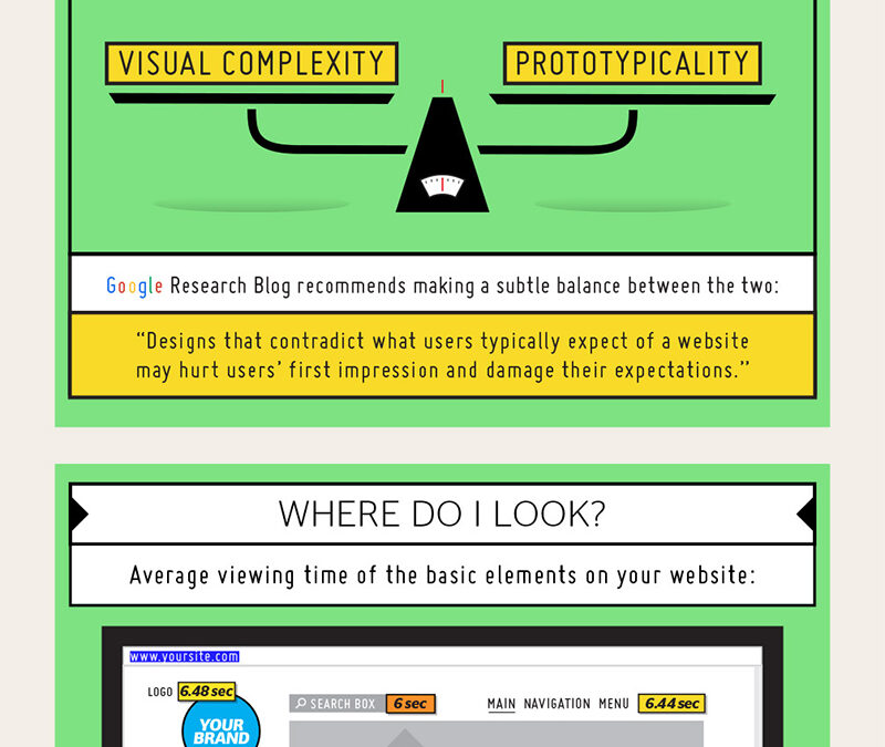
Where Visitors Look
Understanding the eye-tracking patterns of website visitors is essential for designing a user-friendly and engaging website.
By identifying where users tend to focus their attention, small business website owners can strategically place important elements to maximize visibility and drive conversions.
Here are actionable tips for optimizing your website based on users’ gaze patterns:
F-Shaped Scanning Pattern:
- Prioritize Top Left Corner: Place important information, such as your logo, navigation menu, and headline, in the top left corner of your website. This area corresponds to where users’ eyes typically start scanning, according to the F-shaped reading pattern.
- Utilize Visual Hierarchy: Create a clear visual hierarchy by using larger fonts, bold colours, and contrasting elements to draw attention to key content. Organize information in a logical order, with the most important elements positioned towards the top and left-hand side of the page.
- Highlight Call-to-Action Buttons: Make your call-to-action (CTA) buttons prominent and easily distinguishable from surrounding content. Use contrasting colours, compelling copy, and ample whitespace to make CTAs stand out and encourage clicks.
Heatmap Analysis:
- Identify Hotspots: Analyse heatmap data to identify hotspots where users spend the most time on your website. Use this insight to prioritize content placement and optimize the visibility of important information in high-traffic areas.
- Optimize Above-the-Fold Content: Place critical information and key messages above the fold to ensure they’re immediately visible without requiring scrolling. This includes your value proposition, main headline, and primary CTAs.
- Experiment with Layouts: Test different layouts and arrangements of content to see how they impact user engagement and interaction. Use A/B testing tools to compare variations and determine which layout performs best in terms of guiding users’ attention.
Scroll Behaviour:
- Encourage Scrolling: Design your website with a vertical scrolling layout to accommodate users’ natural scrolling behaviour. Incorporate visual cues, such as arrows or animated elements, to indicate that there’s more content below the fold and encourage users to scroll down.
- Content Segmentation: Break up content into digestible sections with clear headings and visual cues to facilitate scanning and navigation. Each section should address a specific topic or aspect of your business, making it easier for users to find relevant information.
- Sticky Navigation Menus: Implement sticky navigation menus that remain visible as users scroll down the page. This ensures that essential navigation options, such as menu items and CTAs, are always accessible and easy to reach.
Mobile Optimization:
- Vertical Layout: Design your mobile website with a vertical layout that accommodates users’ scrolling behaviour on smartphones and tablets. Prioritize content based on importance, with essential information displayed prominently at the top of the page.
- Thumb-Friendly Design: Place interactive elements, such as buttons and links, within easy reach of users’ thumbs to facilitate navigation on touchscreen devices. Keep important buttons towards the bottom of the screen for optimal accessibility.
- Condensed Navigation: Simplify navigation on mobile devices by condensing menu options into a collapsible hamburger menu or dropdown menu. This conserves screen space and provides a cleaner user interface for mobile users.
By incorporating these actionable tips into their website design, small business owners can optimize their websites to align with users’ natural gaze patterns and browsing behaviour.
By strategically placing important elements, prioritizing above-the-fold content, and optimizing for both desktop and mobile devices, businesses can enhance user engagement and drive conversions effectively.
Page Scrolling Habits
Understanding how users scroll through your website is crucial for optimizing layout, content placement, and engagement. By analysing scrolling behaviour, small business website owners can tailor their design to encourage exploration, enhance usability, and maximize conversion opportunities. Here are actionable tips for leveraging page scrolling habits to improve your website:
Natural Scrolling Behaviour:
- Long-Form Content: Incorporate long-form content that encourages users to scroll down the page to consume more information. Break up content into easily digestible sections with clear headings to maintain user interest and encourage continuous scrolling.
- Visual Progress Indicators: Use visual cues such as progress bars, scroll animations, or scroll-triggered effects to indicate how far users have scrolled and what content remains. This helps users understand the depth of the page and encourages them to continue scrolling.
- Anchor Links: Implement anchor links within your content to allow users to navigate directly to specific sections of the page. This enables users to find relevant information quickly without having to scroll through lengthy content manually.
Engaging Below-the-Fold Content:
- Compelling Visuals: Place visually striking imagery, videos, or infographics below the fold to capture users’ attention and entice them to scroll further. Use eye-catching visuals that complement your brand story and communicate key messages effectively.
- Interactive Elements: Incorporate interactive elements such as quizzes, polls, or interactive sliders below the fold to engage users and encourage interaction. Interactive content keeps users engaged and encourages them to explore deeper into your website.
- Calls-to-Action: Include strategically placed calls-to-action (CTAs) below the fold to prompt users to take the desired action, whether it’s making a purchase, signing up for a newsletter, or contacting your business. Use compelling copy and visually appealing buttons to attract attention and drive conversions.
Mobile-Friendly Scrolling:
- Vertical Layout: Optimize your website for vertical scrolling on mobile devices by organizing content into a single column layout. Ensure that users can scroll smoothly without encountering navigation obstacles or usability issues.
- Thumb-Friendly Design: Consider the ergonomics of mobile scrolling by placing important elements within easy reach of users’ thumbs. Avoid placing interactive elements too close to the edges of the screen to prevent accidental clicks or taps.
- Lazy Loading: Implement lazy loading techniques to optimize mobile performance and reduce page load times. Lazy loading delays the loading of below-the-fold content until users scroll down, improving initial page load times and enhancing the overall user experience.
Monitoring and Optimization:
- Analytics Tracking: Use website analytics tools to track scrolling behaviour and engagement metrics, such as scroll depth, time spent on page, and interaction with below-the-fold content. Analyse this data to identify trends and opportunities for optimization.
- A/B Testing: Conduct A/B tests to compare different page layouts, content placements, and scrolling experiences to determine which variations perform best in terms of user engagement and conversion rates. Use insights from A/B tests to refine your website design and maximize effectiveness.
- Continuous Improvement: Regularly review and refine your website based on user feedback, analytics data, and industry best practices. Continuously optimize your website to ensure it remains aligned with evolving user preferences and browsing habits.
By incorporating these actionable tips into their website design, small business owners can leverage page scrolling habits to create engaging, user-friendly experiences that drive engagement and conversions.
By understanding how users interact with content as they scroll through the page, businesses can optimize layout, content placement, and calls-to-action to maximize effectiveness and achieve their goals.
Mobile Friendliness
In an increasingly mobile-centric world, ensuring that your website is optimized for mobile devices is no longer optional – it’s essential for reaching and engaging with your target audience.
With a growing number of users accessing the internet via smartphones and tablets, small business website owners must prioritize mobile friendliness to provide a seamless and enjoyable browsing experience.
Here are actionable tips for optimizing your website for mobile devices:
Responsive Design:
- Utilize Responsive Design: Adopt a responsive web design approach that allows your website to adapt seamlessly to different screen sizes and resolutions. Responsive design ensures that your website looks and functions consistently across a wide range of devices, from smartphones to tablets to desktop computers.
- Test Across Devices: Test your website across various devices and screen sizes to ensure compatibility and responsiveness. Use tools such as Google’s Mobile-Friendly Test or browser developer tools to identify any issues and make necessary adjustments.
- Optimize Touch Interactions: Optimize touch interactions by ensuring that buttons, links, and interactive elements are large enough to be easily tapped with a finger. Leave ample spacing between elements to prevent accidental clicks and improve usability.
Mobile Navigation:
- Simplify Navigation: Simplify navigation on mobile devices by using a hamburger menu or collapsible navigation menu that conserves screen space. Ensure that users can access essential navigation options, such as menu items and CTAs, with minimal effort.
- Thumb-Friendly Design: Consider the ergonomics of mobile browsing by placing important elements within easy reach of users’ thumbs. Avoid placing interactive elements too close to the edges of the screen to prevent accidental taps or swipes.
- Sticky Navigation: Implement sticky navigation menus that remain visible as users scroll down the page. Sticky navigation provides easy access to important navigation options and ensures seamless navigation on mobile devices.
Page Speed Optimization:
- Optimize Loading Speed: Prioritize page speed optimization for mobile devices to minimize loading times and provide a smooth browsing experience. Compress images, minimize server requests, and leverage browser caching to improve performance on mobile devices.
- Lazy Loading: Implement lazy loading techniques to optimize mobile performance and reduce page load times. Lazy loading delays the loading of below-the-fold content until users scroll down, improving initial page load times and enhancing the overall user experience.
- AMP Implementation: Consider implementing Accelerated Mobile Pages (AMP) to create fast-loading, lightweight versions of your web pages specifically designed for mobile devices. AMP can significantly improve page speed and user experience on mobile devices.
Content Optimization:
- Prioritize Content: Prioritize content based on importance and relevance for mobile users. Ensure that essential information, such as product details, contact information, and CTAs, is prominently displayed and easily accessible on mobile devices.
- Condense Content: Condense content for mobile devices by using concise headlines, bullet points, and shorter paragraphs. Break up text-heavy content into digestible chunks to improve readability and engagement on smaller screens.
- Optimize Media Files: Optimize images, videos, and other media files for mobile devices to reduce file sizes and improve loading times. Use responsive image techniques and consider using mobile-friendly video formats to enhance performance on mobile devices.
By implementing these actionable tips, small business website owners can ensure that their websites are mobile-friendly and optimized for a seamless browsing experience across all devices.
By prioritizing responsive design, mobile navigation, page speed optimization, and content optimization, businesses can reach and engage with their target audience effectively in the mobile era.
Conclusion
In conclusion, people judge your website within milliseconds of landing on it, forming rapid impressions based on design, usability, and credibility.
To maximize the effectiveness of your website and encourage users to contact you, focus on creating visually appealing designs, optimizing for mobile devices, and providing clear calls-to-action.
By understanding how users perceive and interact with your website, you can enhance their experience and build stronger connections with your audience.
The post How People Judge Your Website & Decide Whether to Contact You appeared first on Red Website Design.