Comsys Web design offers unsurpassed quality websites in any niche.
Are you looking for ways to improve your business website? Would you like to convert more website visitors into sales enquiries or subscribers?
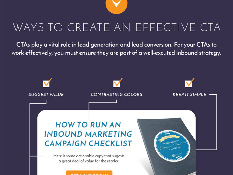
Synecore share their tips for more effective website call to action buttons in this infographic.
They break things down as follows:
- Words to use and avoid
- Ways to create an effective CTA
- Ways to A/B test your website CTA’s
- Key metrics to track
Check out the infographic for more detail.
When it comes to designing an effective website, one of the most crucial elements to consider is your call to action (CTA) buttons. These buttons are the gateway to conversion, making them a pivotal aspect of your website’s success.
While the design and placement of CTA buttons are important, the words you use on them can make a significant difference in your click-through rates and overall user engagement.
In this comprehensive guide, we’ll explore the power of words in your website’s CTA buttons. We’ll discuss the best words that can boost your conversions and the worst ones that can potentially drive users away.
By the end of this article, you’ll have a clear understanding of how to craft compelling CTA buttons that drive results.
The Importance of Effective Call to Action Buttons
Before diving into the best and worst words for your CTA buttons, let’s take a moment to understand why they are so crucial for your website’s success.
- Conversion Rate Optimization (CRO): CTA buttons are the primary drivers of conversion on your website. Whether you want users to sign up for a newsletter, make a purchase, or request more information, the CTA button is what facilitates these actions.
- User Experience (UX): Well-designed and strategically placed CTA buttons improve the overall user experience. They guide users through your website, making it easier for them to find what they’re looking for.
- Engagement: Effective CTA buttons can encourage users to engage with your website. By using persuasive language and appealing design, you can keep users on your site longer and reduce bounce rates.
- Revenue Generation: Ultimately, the success of your website often boils down to revenue generation. When users click on CTA buttons that lead to purchases or sign-ups, it directly impacts your bottom line.
Now that we’ve established the importance of CTA buttons, let’s delve into the best and worst words to use on these buttons.
The Best Words for Your Call to Action Buttons
- “Get Started”: This is a clear and action-oriented phrase that tells users they can begin using your product or service immediately.
- “Learn More”: When users want more information before making a decision, “Learn More” is a non-committal but inviting CTA.
- “Sign Up”: For websites offering subscriptions, newsletters, or memberships, “Sign Up” is a straightforward and widely recognized choice.
- “Join Us”: This phrase creates a sense of belonging and community, making it effective for social networks, forums, or clubs.
- “Get Your Free Trial”: Offering a free trial is an excellent way to entice users. This CTA emphasizes the value they’ll receive at no cost.
- “Add to Cart”: Ideal for e-commerce websites, this phrase clearly communicates the action users need to take to purchase a product.
- “Get Exclusive Access”: This CTA implies that users will gain access to something special or exclusive, making it appealing for membership sites or VIP offers.
- “Download Now”: For software downloads, ebooks, or whitepapers, “Download Now” is a direct and compelling choice.
- “Request a Quote”: Businesses providing services can use this CTA to encourage potential customers to inquire about pricing.
- “Book Your Appointment”: Service-based businesses like salons, clinics, or consulting firms can benefit from this action-oriented phrase.
- “Get Started for Free”: Similar to “Get Your Free Trial,” this CTA emphasizes the zero-cost entry point, reducing user hesitancy.
- “Save Now”: Effective for promotions and discounts, this phrase communicates immediate value to users.
- “Subscribe Now”: Ideal for newsletters or content subscriptions, this CTA invites users to stay updated with your offerings.
- “Shop Now”: A direct and effective CTA for online retailers, it encourages users to start browsing and purchasing.
- “Try It Today”: This phrase implies a sense of urgency and encourages users to take action immediately.
- “Get 50% Off”: If you have a special discount or offer, specifying the discount amount can make your CTA more enticing.
- “Limited Time Offer”: This creates a sense of urgency, motivating users to act quickly before the opportunity expires.
- “See the Difference”: Effective for products or services that offer unique benefits or features.
- “Find Your Perfect Match”: For websites involving matchmaking or personalized recommendations, this phrase speaks directly to the user’s needs.
- “Yes, I Want [Benefit]”: By incorporating the user’s desire directly into the CTA, you make it more personal and persuasive.
The Worst Words for Your Call to Action Buttons
While it’s important to know what words to use, it’s equally crucial to be aware of words that can negatively impact your CTA buttons. Here are some words to avoid:
- “Submit”: This word is vague and uninspiring. It doesn’t tell users what they’re getting by clicking the button.
- “Click Here”: Users expect buttons to be clickable, so there’s no need to state the obvious. Instead, use action-oriented words.
- “Buy Now”: While “Buy Now” can work in some cases, it can be too direct and pushy for certain audiences. Test different phrasing to see what resonates best.
- “Submit Form”: Similar to “Submit,” this phrase lacks specificity and fails to communicate the benefit of taking action.
- “Get It Now”: This CTA is generic and doesn’t convey the value or purpose of the action.
- “Next”: In multi-step forms or processes, using “Next” can be confusing. Users may wonder what comes after “Next.”
- “More Info”: While “Learn More” is more enticing, “More Info” is vague and doesn’t promise value.
- “Continue”: Similar to “Next,” “Continue” can leave users wondering about the next steps.
- “Submit Query”: This phrase is overly formal and doesn’t engage users effectively.
- “Click for Details”: Like “Click Here,” this CTA is redundant and fails to communicate a clear action.
- “Process Payment”: Instead of focusing on the payment process, emphasize the benefit or value of the transaction.
- “Go”: This single-word CTA lacks context and can be confusing to users.
- “More”: “More” doesn’t specify what users will get when they click the button. Use more descriptive words.
- “Enter”: In forms, using “Enter” as a CTA for submitting information lacks engagement.
- “Submit Order”: Instead of “Submit Order,” consider using “Place Order” or a similar phrase that feels more decisive.
- “Login”: While necessary, “Login” buttons can benefit from more inviting language like “Log In Now.”
- “Proceed”: This word can be too formal and lacks the clarity of action found in other CTAs.
- “Confirm”: For confirmation actions, it’s better to use a phrase like “Yes, Confirm My Booking” to make the action explicit.
- “Continue Shopping”: While useful for e-commerce, it’s better to use variations like “Keep Shopping” for a more engaging CTA.
- “Back”: This CTA can lead users away from their current path. Use it sparingly and consider alternatives like “Return” or “Go Back.”
A/B Testing and Beyond
While the best and worst words provided in this guide offer valuable insights, it’s essential to remember that the effectiveness of CTA buttons can vary depending on your audience and website’s specific goals. Conducting A/B testing is a powerful way to determine which words resonate most with your users.
Here are some tips for A/B testing your CTA buttons:
- Test One Variable at a Time: To pinpoint the impact of specific words, test only the text of your CTA buttons while keeping other elements consistent.
- Segment Your Audience: Different user segments may respond differently to CTA button wording. Tailor your CTAs to each audience for maximum impact.
- Measure Multiple Metrics: Don’t solely focus on click-through rates. Consider other metrics like conversion rate, bounce rate, and time on page.
- Iterate and Refine: Use the data from your A/B tests to refine your CTA button wording continually. What works today may not work tomorrow.
- Stay Consistent: Once you’ve identified effective CTA words, maintain consistency across your website to avoid confusing users.
Conclusion
Call to action buttons are the driving force behind website conversions and user engagement. By choosing the right words for your CTAs, you can significantly impact your website’s success. The best words are clear, action-oriented, and focused on the user’s benefit, while the worst words are vague, uninspiring, or confusing.
Remember that there is no one-size-fits-all solution when it comes to CTA button wording. A/B testing is your best ally in discovering what resonates most with your specific audience. Continually refine your CTA buttons to optimize user experience and drive the desired actions on your website.
With the right words and a commitment to testing and improvement, your CTAs can be a powerful tool for achieving your online goals.
The post The Best & Worst Words to Use in Your Website Call to Action Buttons appeared first on Red Website Design.


![The Best & Worst Words to Use in Your Website Call to Action Buttons [Infographic]](https://red-website-design.co.uk/wp-content/uploads/The-Best-Worst-Words-to-Use-in-Your-Website-Call-to-Action-Buttons.jpg)