
Comsys Web design offers unsurpassed quality websites in any niche.
What colour scheme have you chosen to use on your business website? Do your brand colours effectively convey the right message to potential customers?
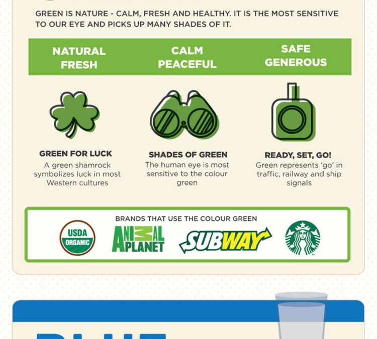
HostPapa share their guide to colour psychology in this infographic.
They show you which colours to use to achieve the following:
- Grab attention and whet the appetite
- Evoke feelings of friendliness
- Stimulate creativity and happiness
- Appear calm, fresh and healthy
- Demonstrate consistency
Check out the infographic for more details.
![Web Design Basics: What Your Brand Colours Say About Your Business [Infographic]](https://red-website-design.co.uk/wp-content/uploads/2019/11/Web-Design-Basics-What-Your-Brand-Colours-Say-About-Your-Business.jpg)
In the dynamic world of web design, every element plays a crucial role in conveying the essence of your brand to your audience.
Among these elements, colour stands out as one of the most powerful tools for communicating your brand’s personality, values, and message.
The colours you choose for your website can evoke specific emotions, associations, and perceptions in your visitors’ minds, influencing their overall impression of your brand.
In this blog post, we’ll delve into the significance of different colours in web design and explore what each hue says about your business.
Red: Passion, Energy, and Boldness
Red is a colour that demands attention and evokes strong emotions. It symbolizes passion, energy, and excitement, making it an excellent choice for brands looking to make a bold statement.
However, harnessing the power of red in web design requires careful consideration and strategic implementation, especially for small businesses aiming to create a memorable online presence.
Here are some in-depth tips and guidance for small businesses on effectively using red in their web design:
- Understand Your Brand Personality: Before incorporating red into your website design, it’s essential to understand your brand’s personality and how it aligns with the characteristics of the colour red. Consider whether your brand exudes passion, energy, and boldness, or if these traits are central to your brand identity. If so, red can be a powerful tool for conveying these attributes to your audience.
- Use Red Sparingly: While red can grab attention and create a sense of urgency, using it too liberally can overwhelm visitors and detract from the overall user experience. Instead, use red strategically to draw attention to specific elements such as call-to-action buttons, important announcements, or promotional offers. By incorporating red accents selectively, you can create visual interest without overwhelming your visitors.
- Create Contrast: Red is a high-impact colour that stands out against most backgrounds. To make the most of its attention-grabbing qualities, pair red with contrasting colours to create visual hierarchy and emphasis. For instance, use red for headlines, buttons, or other key elements against a neutral background to make them stand out. This contrast will guide visitors’ attention to the most important parts of your website and encourage them to take action.
- Consider Cultural Associations: Keep in mind that the meaning and symbolism of colours can vary across different cultures. While red may symbolize passion and energy in Western cultures, it can signify luck, prosperity, or even danger in other parts of the world. If your target audience includes diverse cultural backgrounds, consider how the use of red may be perceived and adjust your design accordingly to ensure it resonates positively with all segments of your audience.
- Test and Iterate: As with any aspect of web design, testing is key to understanding how your audience responds to the use of red on your website. Conduct A/B tests to compare different variations of your design with and without red elements, and analyse the impact on user engagement, conversion rates, and overall user satisfaction. Based on the insights gained from testing, iterate on your design to refine the use of red and optimize its effectiveness in achieving your business goals.
- Ensure Accessibility: When using red for text or other crucial elements on your website, ensure that it maintains sufficient contrast with the background to ensure readability for all users, including those with visual impairments. Use tools such as colour contrast checkers to verify that the contrast ratio meets accessibility standards set forth by organizations like the Web Content Accessibility Guidelines (WCAG). Additionally, consider providing alternative colour options or text alternatives for users who may have difficulty distinguishing red text.
- Align with Brand Messaging: Beyond its visual impact, red should also align with your brand’s messaging and values. Consider how the use of red fits into your overall brand narrative and whether it reinforces the key messages you want to convey to your audience. For example, if your brand is known for its boldness and innovation, incorporating red into your website design can help reinforce this message and differentiate your brand from competitors.
Orange: Creativity, Vitality, and Friendliness
Orange is a vibrant and energetic colour that radiates warmth, creativity, and enthusiasm. For small businesses, leveraging the power of orange in web design can be an effective way to create a memorable and engaging online presence.
Here are some in-depth tips and guidance for small businesses on effectively using orange in their web design:
- Reflect Your Brand Personality: Before incorporating orange into your website design, consider whether it aligns with your brand’s personality and values. Orange is often associated with creativity, vitality, and friendliness, so if these traits resonate with your brand identity, orange can help convey these attributes to your audience effectively. However, if your brand is more conservative or serious in nature, orange may not be the best fit.
- Use Orange Accents: While orange can be attention-grabbing, it’s essential to use it strategically and sparingly to avoid overwhelming your visitors. Instead of using orange as the dominant colour throughout your website, consider incorporating it as accents or highlights to draw attention to specific elements such as call-to-action buttons, headlines, or promotional banners. This selective use of orange can create visual interest without detracting from the overall user experience.
- Pair Orange with Complementary Colours: Orange pairs well with a variety of colours, including blue, green, and purple. Experiment with different colour combinations to find ones that complement orange and enhance its vibrancy. For example, pairing orange with blue can create a striking contrast that captures attention, while combining it with green can evoke a sense of nature and freshness. Choose complementary colours that reinforce your brand’s messaging and create a cohesive visual identity for your website.
- Convey a Sense of Energy and Vitality: Orange is often associated with energy and vitality, making it an excellent choice for brands that want to convey a sense of enthusiasm and excitement. Use orange to inject energy into your website design and create a positive and uplifting atmosphere for your visitors. Whether it’s through vibrant graphics, animated elements, or dynamic typography, leverage the energetic qualities of orange to captivate your audience and keep them engaged with your content.
- Foster a Feeling of Friendliness and Approachability: Orange is also associated with friendliness and approachability, making it a great choice for brands that want to connect with their audience on a personal level. Use orange to create a welcoming and inviting environment for your visitors, where they feel comfortable exploring your website and interacting with your brand. Incorporate warm tones and friendly imagery to reinforce the sense of hospitality and openness that orange conveys.
- Test and Iterate: As with any aspect of web design, testing is crucial to understanding how your audience responds to the use of orange on your website. Conduct A/B tests to compare different variations of your design with and without orange elements, and analyse the impact on user engagement, conversion rates, and overall user satisfaction. Based on the insights gained from testing, iterate on your design to refine the use of orange and optimize its effectiveness in achieving your business goals.
- Ensure Accessibility: When using orange for text or other important elements on your website, ensure that it maintains sufficient contrast with the background to ensure readability for all users, including those with visual impairments. Use colour contrast checkers to verify that the contrast ratio meets accessibility standards, and consider providing alternative colour options or text alternatives for users who may have difficulty distinguishing orange text.
- Align with Brand Messaging: Beyond its visual impact, orange should also align with your brand’s messaging and values. Consider how the use of orange fits into your overall brand narrative and whether it reinforces the key messages you want to convey to your audience. If creativity, vitality, and friendliness are core aspects of your brand identity, incorporating orange into your website design can help bring these qualities to life and create a memorable brand experience for your visitors.
Yellow: Optimism, Clarity, and Cheerfulness
Yellow is a vibrant and cheerful colour that symbolizes optimism, clarity, and happiness.
When used thoughtfully in web design, yellow can evoke a sense of positivity and warmth, making it an excellent choice for small businesses looking to create a welcoming and engaging online presence.
Here are some in-depth tips and guidance for small businesses on effectively using yellow in their web design:
- Reflect Your Brand’s Personality: Before incorporating yellow into your website design, consider whether it aligns with your brand’s personality and values. Yellow is often associated with optimism, clarity, and cheerfulness, so if these traits resonate with your brand identity, yellow can help convey these attributes to your audience effectively. However, if your brand is more serious or conservative in nature, yellow may not be the best fit.
- Use Yellow Strategically: Yellow is a high-impact colour that can grab attention and create a sense of urgency. However, using it too liberally can overwhelm visitors and detract from the overall user experience. Instead, use yellow strategically to draw attention to specific elements such as call-to-action buttons, important announcements, or promotional offers. By incorporating yellow accents selectively, you can create visual interest without overwhelming your visitors.
- Create Contrast: Yellow stands out against most backgrounds, making it an excellent choice for creating contrast and emphasis. Pair yellow with complementary colours such as blue or purple to create visual hierarchy and guide visitors’ attention to the most important parts of your website. For example, use yellow for headlines or buttons against a neutral background to make them stand out and encourage interaction.
- Convey a Sense of Positivity and Warmth: Yellow is often associated with positivity and warmth, making it a great choice for brands that want to create a welcoming and inviting atmosphere for their visitors. Use yellow to infuse your website with a sense of optimism and cheerfulness, whether it’s through vibrant graphics, playful animations, or sunny imagery. By incorporating yellow into your design, you can create a positive and uplifting experience that resonates with your audience.
- Enhance Readability: When using yellow for text or other important elements on your website, ensure that it maintains sufficient contrast with the background to ensure readability for all users, including those with visual impairments. Use colour contrast checkers to verify that the contrast ratio meets accessibility standards, and consider adjusting the shade or intensity of yellow to improve legibility if necessary.
- Consider Cultural Associations: Keep in mind that the meaning and symbolism of colours can vary across different cultures. While yellow may symbolize optimism and happiness in many cultures, it can also be associated with caution or cowardice in others. If your target audience includes diverse cultural backgrounds, consider how the use of yellow may be perceived and adjust your design accordingly to ensure it resonates positively with all segments of your audience.
- Test and Iterate: As with any aspect of web design, testing is key to understanding how your audience responds to the use of yellow on your website. Conduct A/B tests to compare different variations of your design with and without yellow elements, and analyse the impact on user engagement, conversion rates, and overall user satisfaction. Based on the insights gained from testing, iterate on your design to refine the use of yellow and optimize its effectiveness in achieving your business goals.
- Align with Brand Messaging: Beyond its visual impact, yellow should also align with your brand’s messaging and values. Consider how the use of yellow fits into your overall brand narrative and whether it reinforces the key messages you want to convey to your audience. If optimism, clarity, and cheerfulness are core aspects of your brand identity, incorporating yellow into your website design can help bring these qualities to life and create a memorable brand experience for your visitors.
Green: Growth, Harmony, and Nature
Green is a versatile and calming colour that symbolizes growth, harmony, and connection with nature. For small businesses, incorporating green into web design can evoke feelings of trust, reliability, and environmental responsibility.
Here are some in-depth tips and guidance for small businesses on effectively using green in their web design:
- Reflect Your Brand’s Commitment to Sustainability: If your business prioritizes sustainability and environmental responsibility, green can be a powerful colour to incorporate into your website design. Green is strongly associated with nature and eco-friendliness, making it an ideal choice for brands that want to communicate their commitment to environmental stewardship. Consider using shades of green to convey your brand’s values and inspire trust and confidence in environmentally-conscious consumers.
- Use Green to Create a Sense of Harmony: Green is often perceived as a calming and harmonious colour that promotes a sense of balance and well-being. Incorporating green into your website design can help create a tranquil and inviting atmosphere for your visitors, encouraging them to explore your content and engage with your brand. Use green as a background colour or in subtle accents to evoke a sense of serenity and relaxation, fostering a positive user experience.
- Leverage Green for Growth and Vitality: Green is also associated with growth, vitality, and renewal, making it an excellent choice for brands that want to convey a sense of progress and forward momentum. Use shades of green to symbolize growth and development, whether it’s showcasing new products or services, highlighting achievements and milestones, or communicating your brand’s evolution over time. Green can inspire confidence in your audience and convey a sense of optimism for the future.
- Pair Green with Complementary Colours: Green pairs well with a variety of colours, including earth tones such as brown and beige, as well as complementary colours such as blue and yellow. Experiment with different colour combinations to find ones that complement green and enhance its visual impact. For example, combining green with blue can create a calming and refreshing aesthetic, while pairing it with yellow can evoke a sense of energy and vitality. Choose colour schemes that reflect your brand’s personality and create a cohesive visual identity for your website.
- Convey Trust and Reliability: Green is often associated with qualities such as trust, reliability, and stability, making it a popular choice for brands in industries such as finance, healthcare, and technology. Incorporating green into your website design can help instill confidence in your audience and reinforce your brand’s credibility and dependability. Use green for important elements such as contact information, testimonials, and trust seals to create a sense of trustworthiness and reliability.
- Embrace Nature-Inspired Design Elements: Green is strongly associated with nature, making it an ideal colour for brands that want to evoke feelings of connection with the natural world. Incorporate nature-inspired design elements such as foliage, plants, and landscapes into your website design to reinforce the green colour palette and create a cohesive theme. By bringing elements of the outdoors into your website, you can create a refreshing and rejuvenating experience for your visitors, fostering a deeper connection with your brand.
- Test and Iterate: As with any aspect of web design, testing is essential to understanding how your audience responds to the use of green on your website. Conduct A/B tests to compare different variations of your design with and without green elements, and analyse the impact on user engagement, conversion rates, and overall user satisfaction. Based on the insights gained from testing, iterate on your design to refine the use of green and optimize its effectiveness in achieving your business goals.
- Align with Brand Messaging: Beyond its visual impact, green should also align with your brand’s messaging and values. Consider how the use of green fits into your overall brand narrative and whether it reinforces the key messages you want to convey to your audience. If growth, harmony, and environmental responsibility are core aspects of your brand identity, incorporating green into your website design can help communicate these values and create a memorable brand experience for your visitors.
Blue: Trust, Stability, and Serenity
Blue is a universally loved colour that conveys a sense of trust, stability, and serenity. For small businesses, incorporating blue into web design can instill confidence in visitors and create a positive first impression.
Here are some in-depth tips and guidance for small businesses on effectively using blue in their web design:
- Establish Trust and Credibility: Blue is often associated with qualities such as trustworthiness, reliability, and professionalism, making it an ideal choice for brands that want to convey a sense of trust and credibility to their audience. Use blue for important elements such as navigation menus, contact information, and calls-to-action to create a sense of stability and reassurance. By incorporating blue into your website design, you can instill confidence in visitors and encourage them to engage with your brand.
- Create a Calming and Serene Atmosphere: Blue is known for its calming and soothing qualities, making it an excellent choice for creating a tranquil and serene atmosphere on your website. Use shades of blue to create a harmonious and relaxing environment for your visitors, whether it’s through the background colour, imagery, or accents. By immersing visitors in a calming blue palette, you can create a positive user experience that encourages them to explore your content and engage with your brand.
- Leverage Blue for Clear Communication: Blue is also associated with clarity and communication, making it an effective colour choice for conveying important information on your website. Use blue for text, headings, and other content to ensure readability and comprehension for your audience. Blue text on a white background, for example, provides a high level of contrast and readability, making it easy for visitors to absorb your message quickly and efficiently.
- Pair Blue with Complementary Colours: Blue pairs well with a variety of colours, including white, grey, and lighter shades of blue. Experiment with different colour combinations to find ones that complement blue and enhance its visual impact. For example, combining blue with white creates a clean and minimalist aesthetic, while pairing it with grey can add depth and sophistication to your design. Choose colour schemes that reflect your brand’s personality and create a cohesive visual identity for your website.
- Evoke a Sense of Professionalism: Blue is often perceived as a professional and corporate colour, making it a popular choice for brands in industries such as finance, technology, and healthcare. Incorporating blue into your website design can help convey a sense of professionalism and authority to your audience, positioning your brand as trustworthy and dependable. Use blue for elements such as logos, headers, and footers to create a polished and professional appearance that inspires confidence in visitors.
- Test and Iterate: As with any aspect of web design, testing is key to understanding how your audience responds to the use of blue on your website. Conduct A/B tests to compare different variations of your design with and without blue elements, and analyse the impact on user engagement, conversion rates, and overall user satisfaction. Based on the insights gained from testing, iterate on your design to refine the use of blue and optimize its effectiveness in achieving your business goals.
- Ensure Accessibility: When using blue for text or other important elements on your website, ensure that it maintains sufficient contrast with the background to ensure readability for all users, including those with visual impairments. Use colour contrast checkers to verify that the contrast ratio meets accessibility standards, and consider adjusting the shade or intensity of blue to improve legibility if necessary.
- Align with Brand Messaging: Beyond its visual impact, blue should also align with your brand’s messaging and values. Consider how the use of blue fits into your overall brand narrative and whether it reinforces the key messages you want to convey to your audience. If trust, stability, and professionalism are core aspects of your brand identity, incorporating blue into your website design can help communicate these values and create a memorable brand experience for your visitors.
Purple: Luxury, Creativity, and Spirituality
Purple is a colour associated with luxury, creativity, and spirituality, making it a compelling choice for small businesses aiming to evoke a sense of sophistication and uniqueness in their web design.
Here are some in-depth tips and guidance for small businesses on effectively using purple in their web design:
- Establish a Sense of Luxury and Exclusivity: Purple has long been associated with royalty, luxury, and extravagance, making it an excellent choice for brands that want to convey a sense of exclusivity and sophistication. Incorporate shades of purple into your website design to create a luxurious and opulent atmosphere that captivates visitors and sets your brand apart from competitors. Use purple for elements such as headers, buttons, and accents to create a sense of elegance and refinement.
- Foster Creativity and Imagination: Purple is also associated with creativity, imagination, and innovation, making it a powerful colour choice for brands that want to inspire and engage their audience. Use purple to inject a sense of creativity and whimsy into your website design, whether it’s through bold graphics, playful animations, or imaginative typography. By incorporating purple into your design, you can create a visually stimulating experience that encourages visitors to explore and interact with your brand.
- Convey a Sense of Spirituality and Mystery: Purple is often associated with spirituality, mysticism, and introspection, making it an intriguing choice for brands that want to evoke a sense of depth and intrigue in their web design. Use shades of purple to create a mysterious and enigmatic atmosphere that captivates visitors and sparks their curiosity. Incorporate elements such as mystical imagery, ethereal patterns, or subtle gradients to enhance the spiritual undertones of purple and create a captivating brand experience.
- Pair Purple with Complementary Colours: Purple pairs well with a variety of colours, including gold, silver, and white. Experiment with different colour combinations to find ones that complement purple and enhance its visual impact. For example, combining purple with gold creates a regal and luxurious aesthetic, while pairing it with silver can add a touch of modern elegance. Choose colour schemes that reflect your brand’s personality and create a cohesive visual identity for your website.
- Ensure Accessibility: When using purple for text or other important elements on your website, ensure that it maintains sufficient contrast with the background to ensure readability for all users, including those with visual impairments. Use colour contrast checkers to verify that the contrast ratio meets accessibility standards, and consider adjusting the shade or intensity of purple to improve legibility if necessary.
- Test and Iterate: As with any aspect of web design, testing is key to understanding how your audience responds to the use of purple on your website. Conduct A/B tests to compare different variations of your design with and without purple elements, and analyse the impact on user engagement, conversion rates, and overall user satisfaction. Based on the insights gained from testing, iterate on your design to refine the use of purple and optimize its effectiveness in achieving your business goals.
- Align with Brand Messaging: Beyond its visual impact, purple should also align with your brand’s messaging and values. Consider how the use of purple fits into your overall brand narrative and whether it reinforces the key messages you want to convey to your audience. If luxury, creativity, and spirituality are core aspects of your brand identity, incorporating purple into your website design can help communicate these values and create a memorable brand experience for your visitors.
Brown: Stability, Comfort, and Earthiness
Brown is a warm and grounding colour that evokes feelings of stability, comfort, and connection to the natural world. For small businesses, incorporating brown into web design can create a sense of reliability and authenticity while fostering a welcoming atmosphere for visitors.
Here are some in-depth tips and guidance for small businesses on effectively using brown in their web design:
- Reflect Your Brand’s Values: Before incorporating brown into your website design, consider whether it aligns with your brand’s values and identity. Brown is often associated with qualities such as reliability, authenticity, and earthiness, making it an ideal choice for brands that want to convey a down-to-earth and genuine image. If your brand values sustainability, craftsmanship, or tradition, brown can help communicate these values to your audience effectively.
- Use Brown for a Warm and Inviting Atmosphere: Brown is a warm and inviting colour that can create a cozy and welcoming atmosphere for visitors to your website. Use shades of brown for background elements, textures, or accents to evoke a sense of comfort and familiarity. By incorporating brown into your design, you can create a space that feels like home and encourages visitors to linger and explore.
- Pair Brown with Complementary Colours: Brown pairs well with a variety of colours, including earth tones such as green, beige, and rust, as well as neutral colours such as white and grey. Experiment with different colour combinations to find ones that complement brown and enhance its visual impact. For example, combining brown with green can create a natural and rustic aesthetic, while pairing it with beige can add warmth and softness to your design. Choose colour schemes that reflect your brand’s personality and create a cohesive visual identity for your website.
- Convey a Sense of Stability and Reliability: Brown is often perceived as a stable and reliable colour that conveys a sense of strength and dependability. Incorporating brown into your website design can help instill confidence in visitors and create a positive first impression. Use brown for important elements such as headers, navigation menus, and call-to-action buttons to create a sense of stability and reassurance. By incorporating brown into your design, you can communicate to visitors that your brand is trustworthy and dependable.
- Embrace Nature-Inspired Design Elements: Brown is strongly associated with the natural world, making it an ideal colour choice for brands that want to evoke feelings of connection to nature. Incorporate nature-inspired design elements such as wood textures, leaf motifs, or earthy patterns into your website design to reinforce the brown colour palette and create a cohesive theme. By bringing elements of the outdoors into your website, you can create a calming and rejuvenating experience for visitors, fostering a deeper connection with your brand.
- Test and Iterate: As with any aspect of web design, testing is key to understanding how your audience responds to the use of brown on your website. Conduct A/B tests to compare different variations of your design with and without brown elements, and analyse the impact on user engagement, conversion rates, and overall user satisfaction. Based on the insights gained from testing, iterate on your design to refine the use of brown and optimize its effectiveness in achieving your business goals.
- Align with Brand Messaging: Beyond its visual impact, brown should also align with your brand’s messaging and values. Consider how the use of brown fits into your overall brand narrative and whether it reinforces the key messages you want to convey to your audience. If stability, comfort, and authenticity are core aspects of your brand identity, incorporating brown into your website design can help communicate these values and create a memorable brand experience for your visitors.
Black: Sophistication, Elegance, and Authority
Black is a timeless and versatile colour that exudes sophistication, elegance, and authority. Incorporating black into web design can create a sleek and polished aesthetic, making it an excellent choice for small businesses aiming to make a bold and memorable statement.
Here are some in-depth tips and guidance for small businesses on effectively using black in their web design:
- Establish a Sense of Sophistication and Elegance: Black is often associated with qualities such as sophistication, elegance, and luxury, making it a powerful colour choice for brands that want to convey a sense of refinement and exclusivity. Use black for key design elements such as headers, navigation menus, and typography to create a sleek and polished appearance that captivates visitors and reinforces your brand’s upscale image.
- Create Visual Contrast and Emphasis: Black is a high-contrast colour that stands out against most backgrounds, making it an effective tool for creating visual hierarchy and emphasis in your web design. Use black to highlight important elements such as headlines, call-to-action buttons, and product images, drawing visitors’ attention to key areas of your website and guiding them towards desired actions.
- Use Black as a Background or Accent Color: Black can be used as both a background colour and an accent colour in web design, depending on the desired effect. A black background can create a dramatic and immersive experience, especially when combined with vibrant colours or striking imagery. Alternatively, using black as an accent colour against lighter backgrounds can add depth and sophistication to your design without overpowering the overall aesthetic.
- Pair Black with Contrasting Colours: Black pairs well with a variety of contrasting colours, including white, gold, silver, and bright hues. Experiment with different colour combinations to find ones that complement black and enhance its visual impact. For example, combining black with white creates a classic and timeless aesthetic, while pairing it with gold or silver accents adds a touch of luxury and opulence. Choose colour schemes that reflect your brand’s personality and create a cohesive visual identity for your website.
- Convey a Sense of Authority and Trustworthiness: Black is often associated with authority and professionalism, making it a popular choice for brands in industries such as finance, law, and technology. Incorporating black into your website design can help convey a sense of authority and trustworthiness to your audience, positioning your brand as credible and dependable. Use black for important elements such as logos, testimonials, and contact information to create a sense of confidence and reliability.
- Ensure Readability and Accessibility: When using black for text or other important elements on your website, ensure that it maintains sufficient contrast with the background to ensure readability for all users, including those with visual impairments. Use colour contrast checkers to verify that the contrast ratio meets accessibility standards, and consider adjusting the shade or intensity of black to improve legibility if necessary.
- Test and Iterate: As with any aspect of web design, testing is key to understanding how your audience responds to the use of black on your website. Conduct A/B tests to compare different variations of your design with and without black elements, and analyse the impact on user engagement, conversion rates, and overall user satisfaction. Based on the insights gained from testing, iterate on your design to refine the use of black and optimize its effectiveness in achieving your business goals.
- Align with Brand Messaging: Beyond its visual impact, black should also align with your brand’s messaging and values. Consider how the use of black fits into your overall brand narrative and whether it reinforces the key messages you want to convey to your audience. If sophistication, elegance, and authority are core aspects of your brand identity, incorporating black into your website design can help communicate these values and create a memorable brand experience for your visitors.
Conclusion
In conclusion, the colours you choose for your website can have a significant impact on how your brand is perceived by your audience.
By understanding the psychological associations and cultural meanings of different colours, you can create a website that effectively communicates your brand’s personality, values, and message.
Whether you opt for the passion of red, the warmth of orange, the optimism of yellow, the tranquility of green, the trust of blue, the luxury of purple, the stability of brown, or the sophistication of black, the key is to use colour strategically to create a cohesive and compelling brand experience for your visitors.
The post Web Design Basics: What Your Brand Colours Say About Your Business appeared first on Red Website Design.